Trend
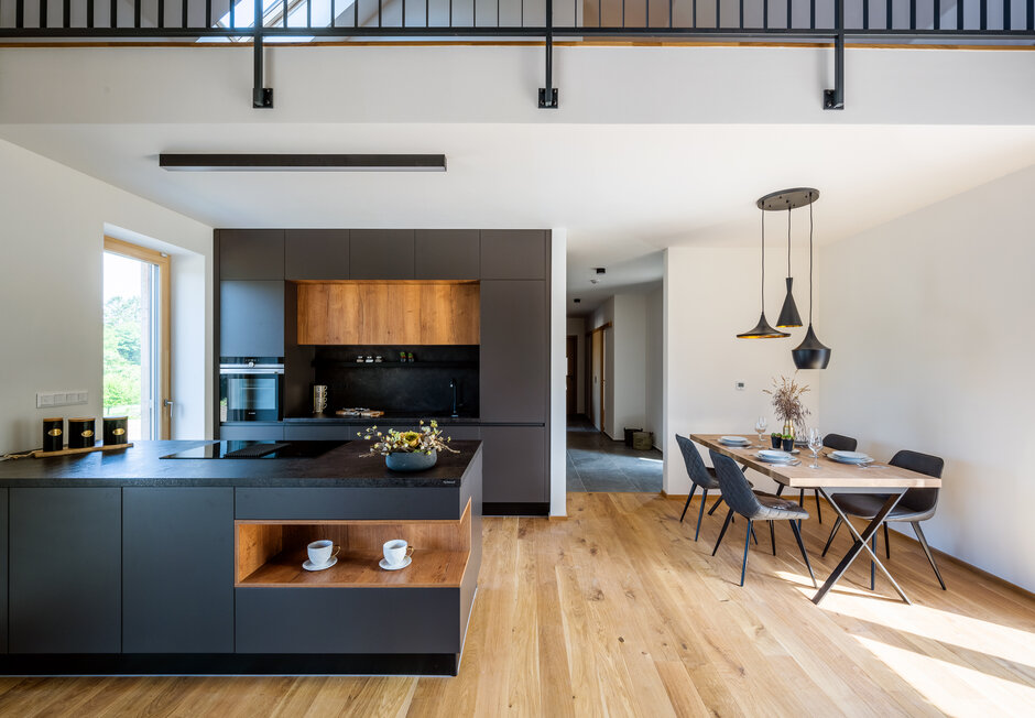
Slate Grey Concrete | Cognac
Realize the dreams of others. This one is hers.
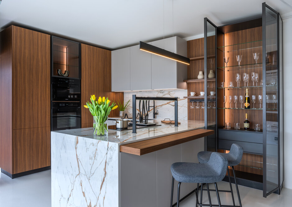
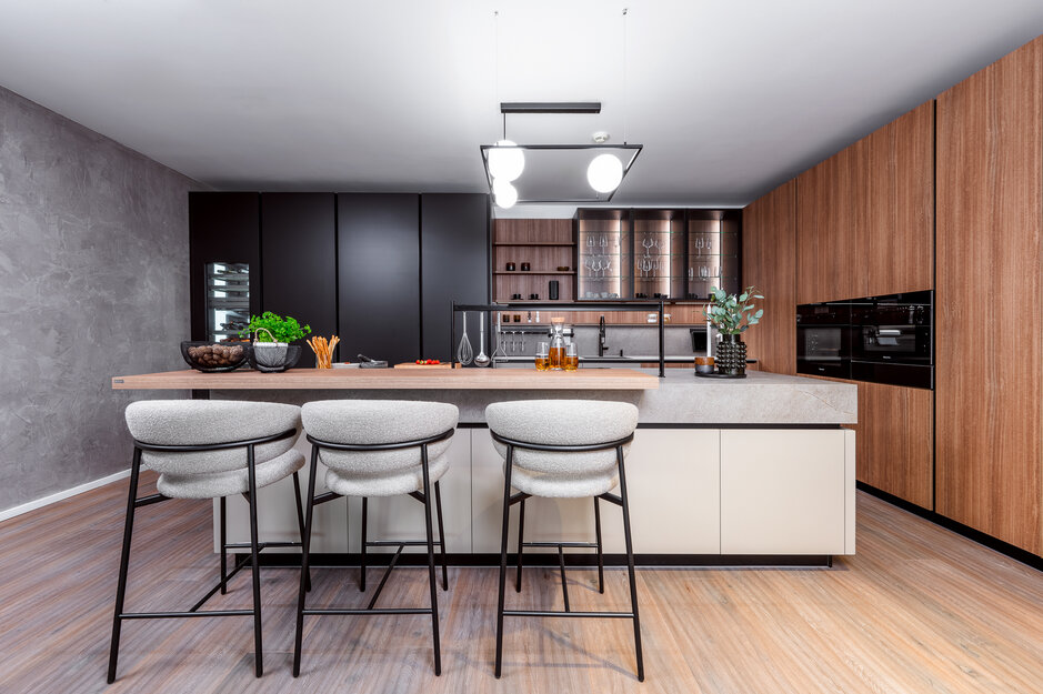
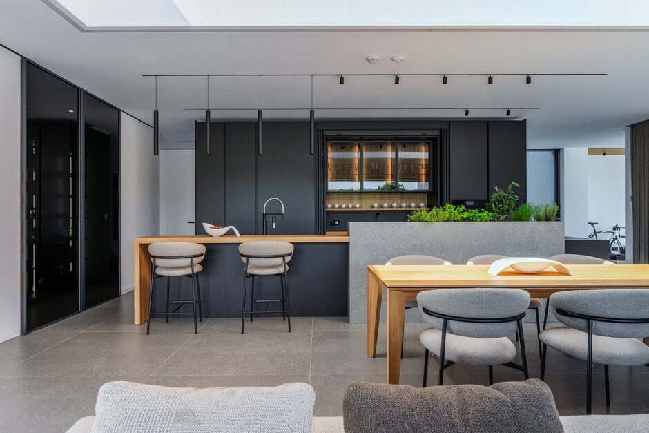
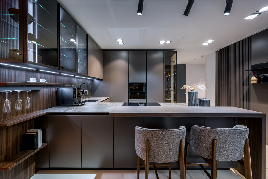
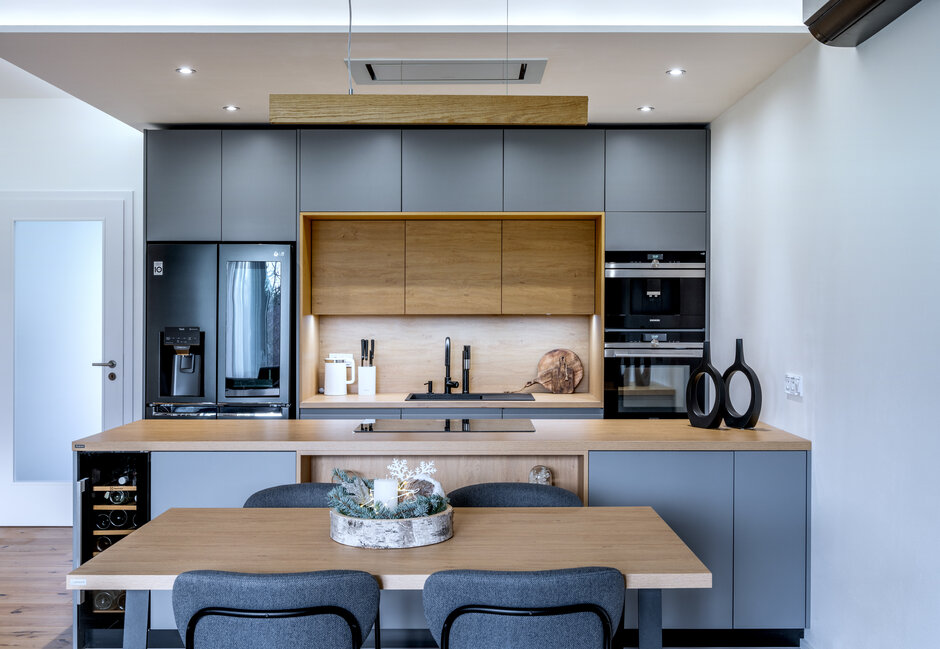
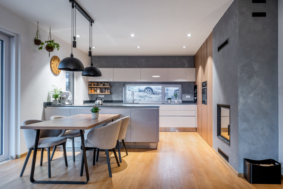
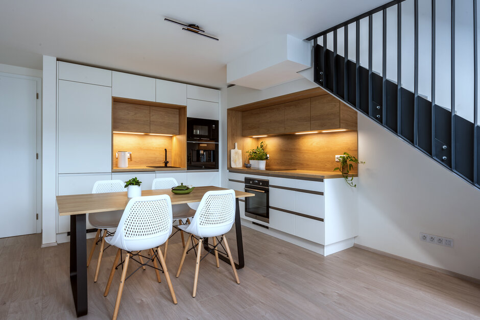
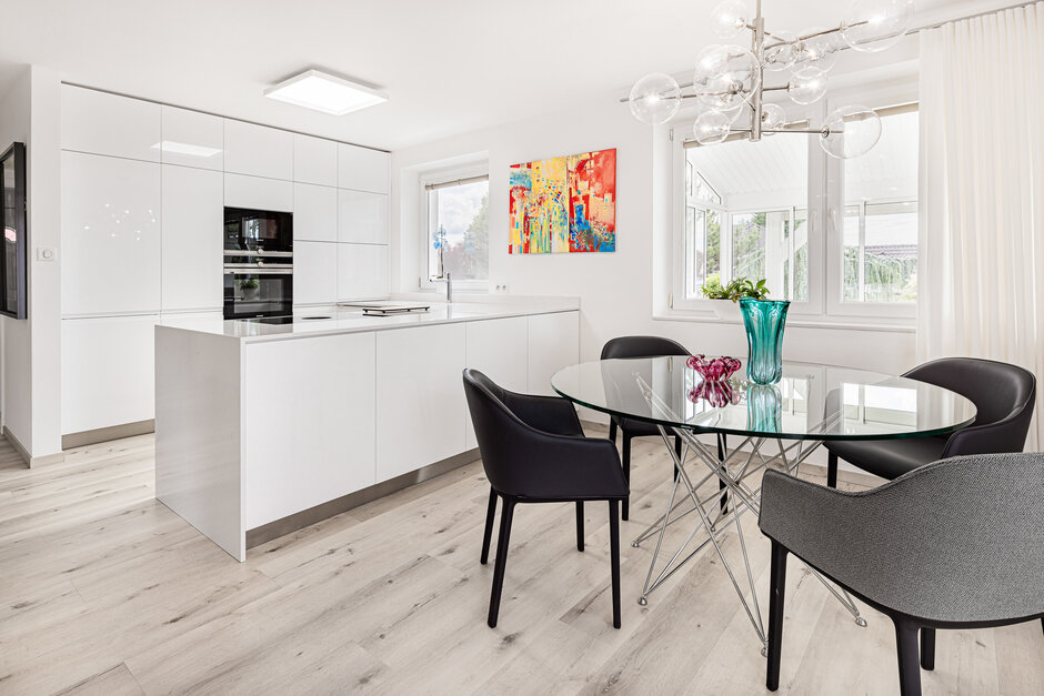
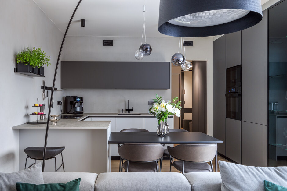
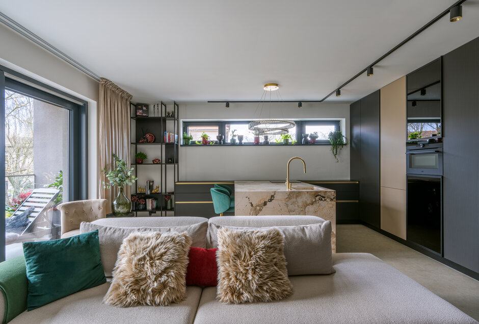
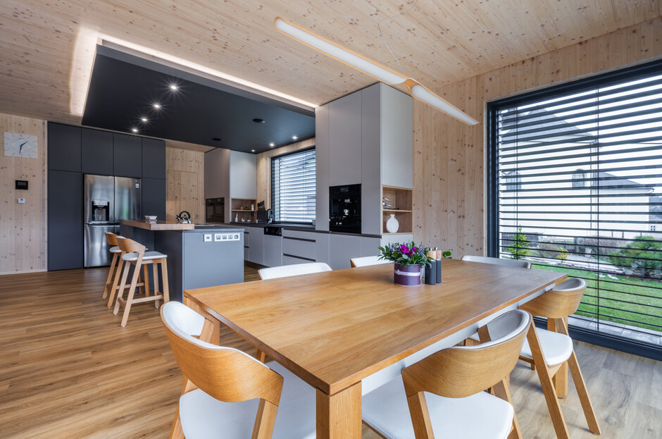
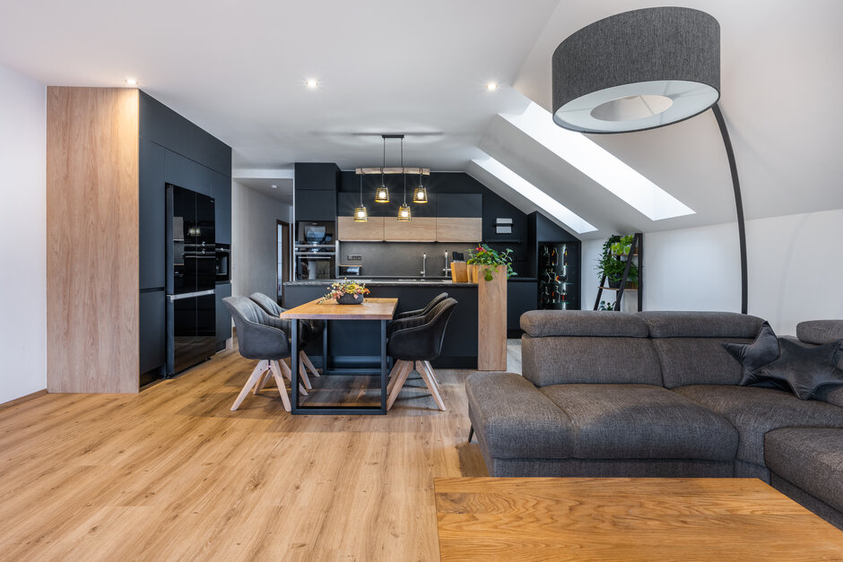
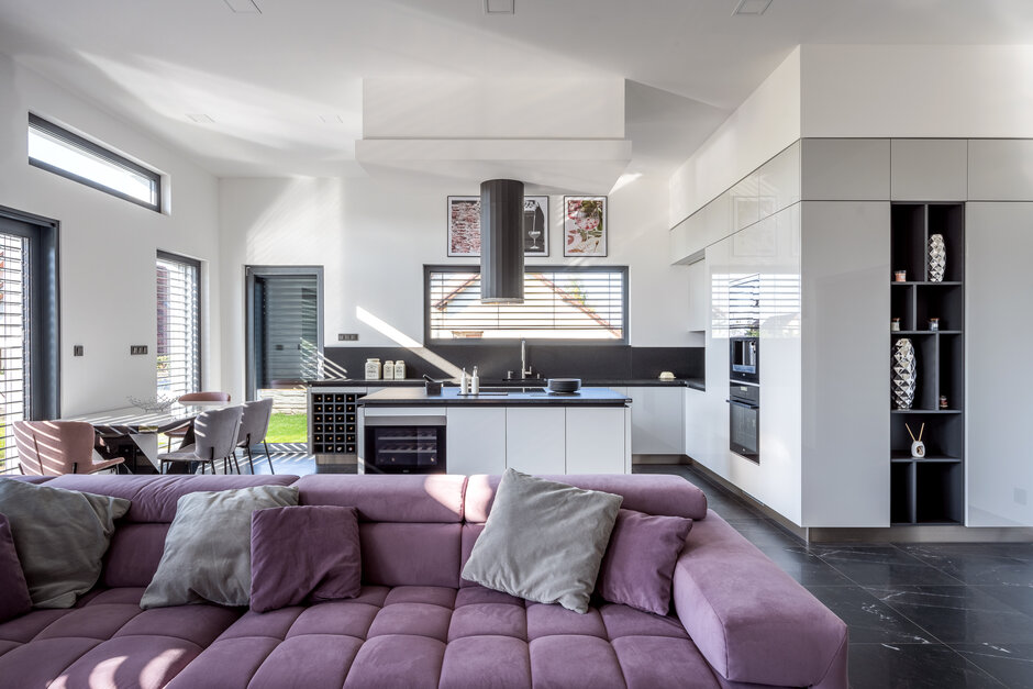
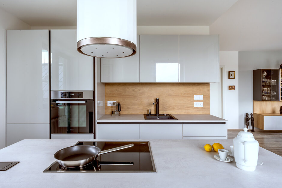
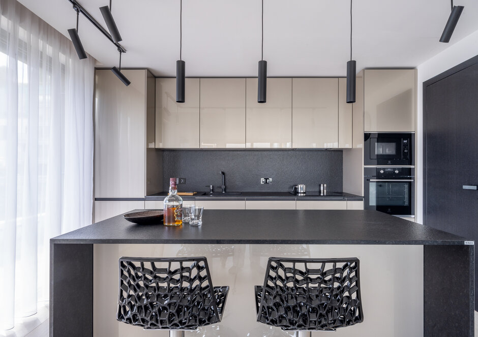
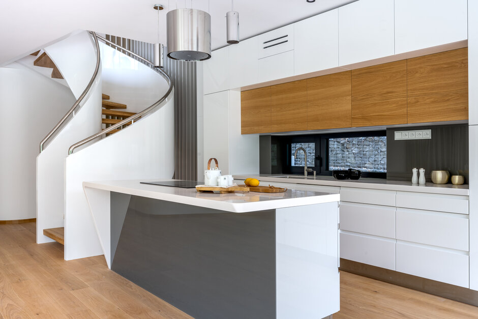
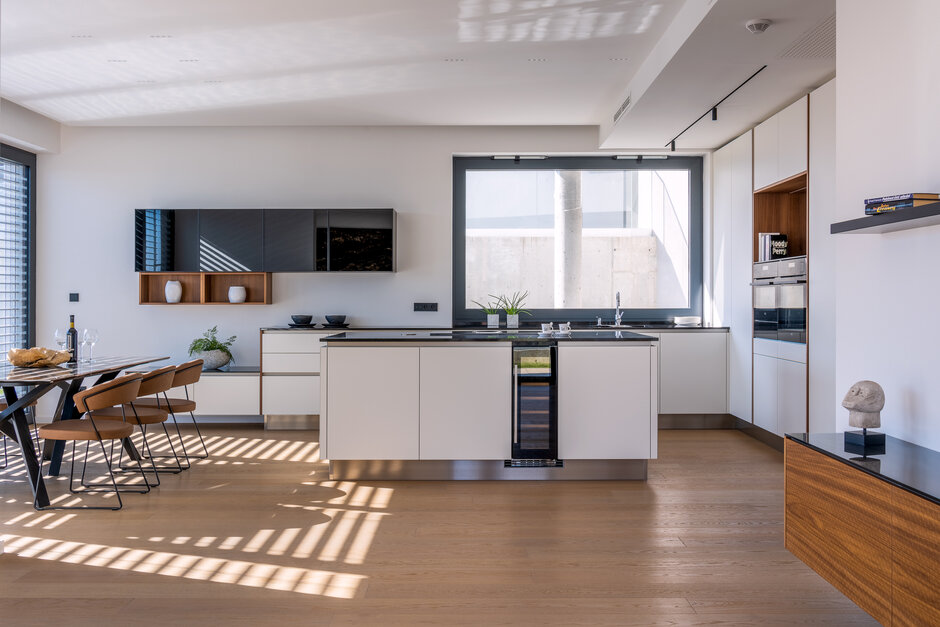
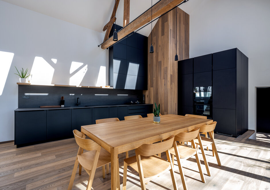
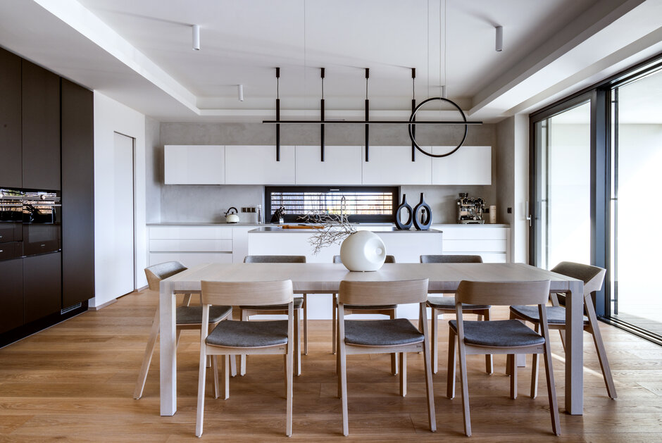
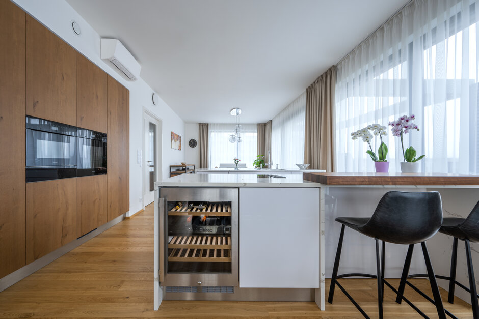
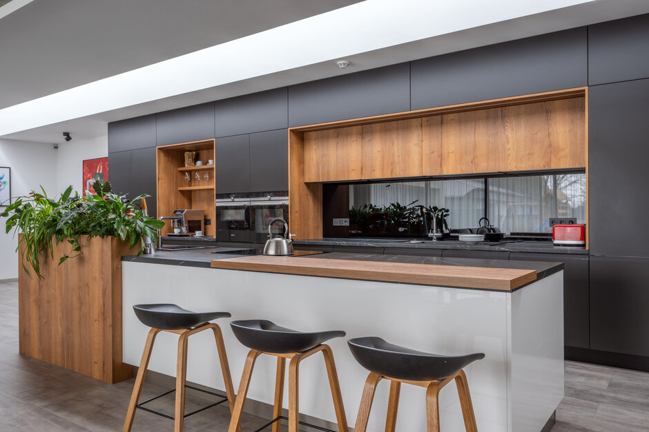
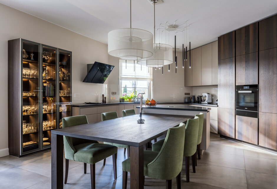
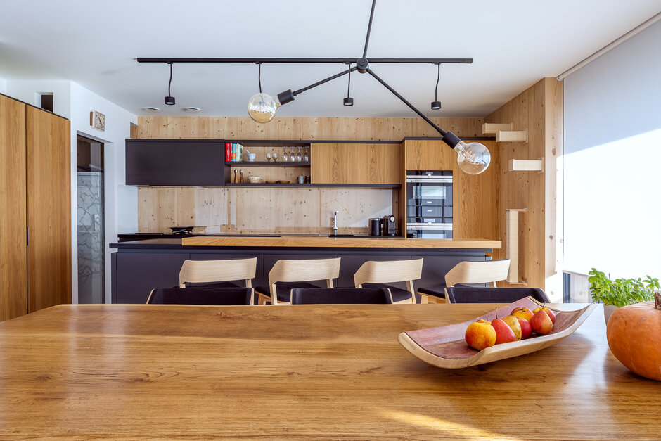
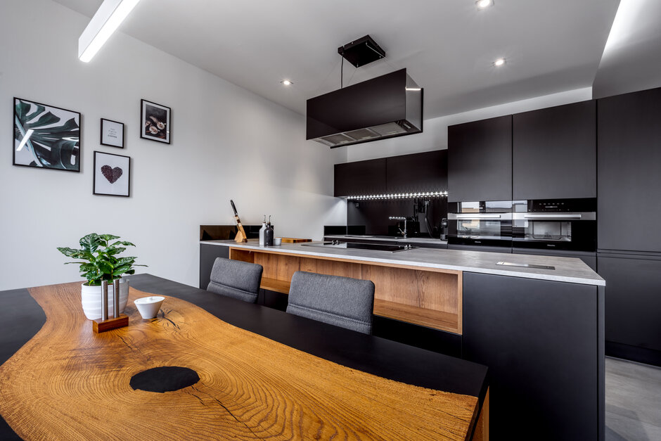
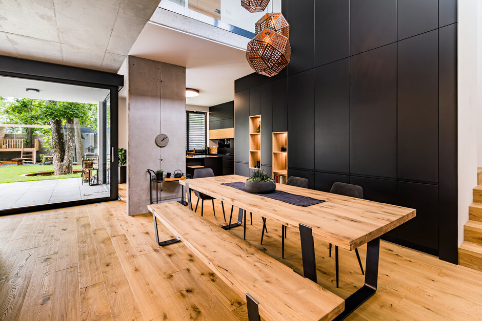
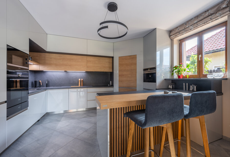
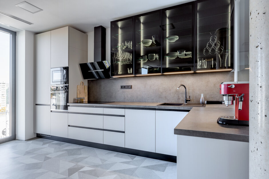
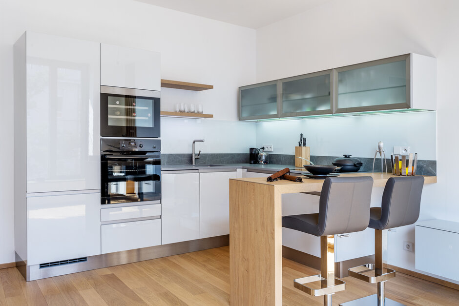
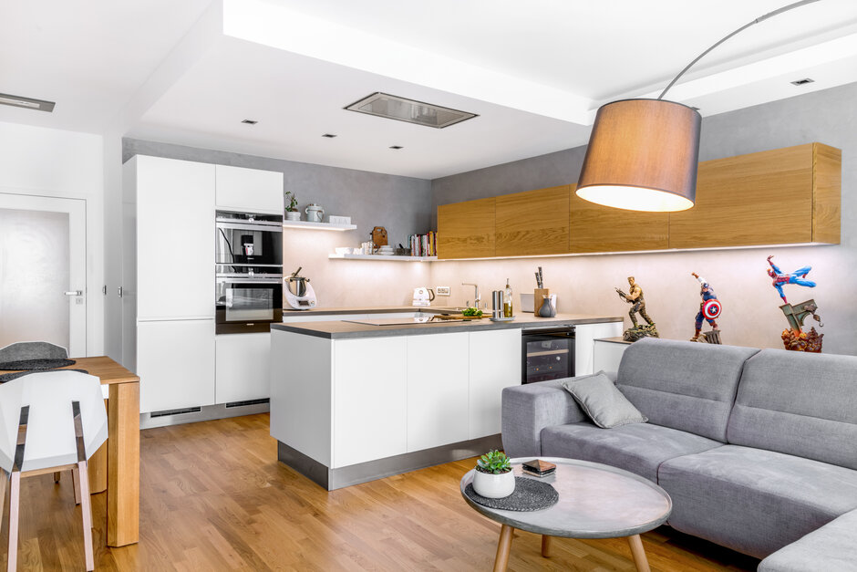
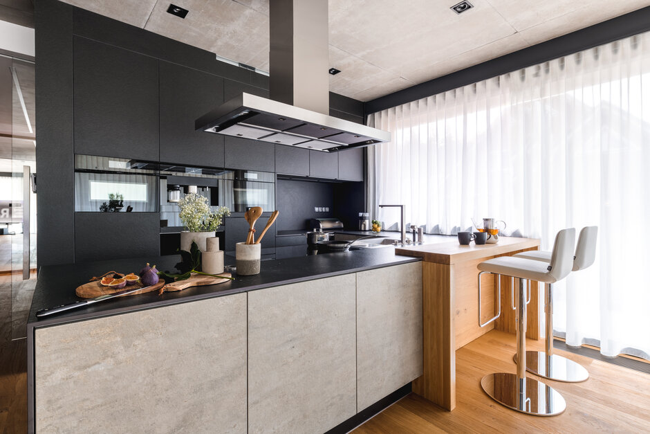
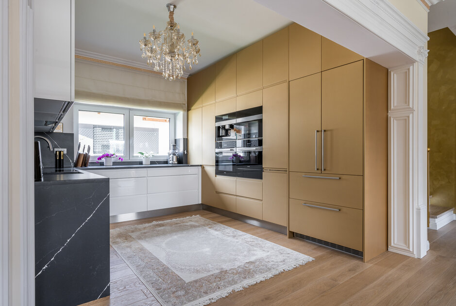
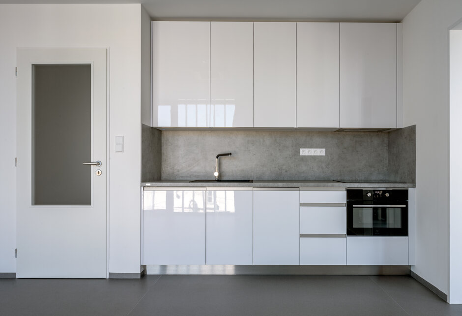
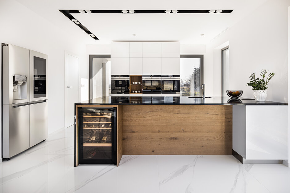
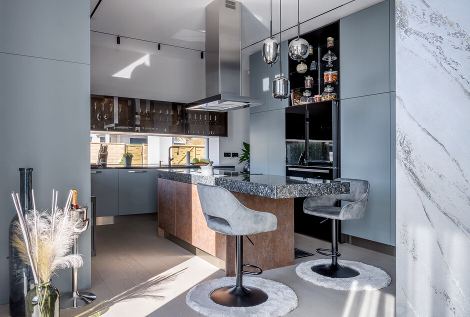
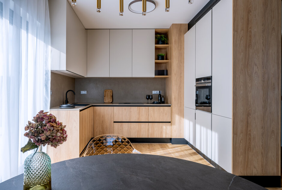
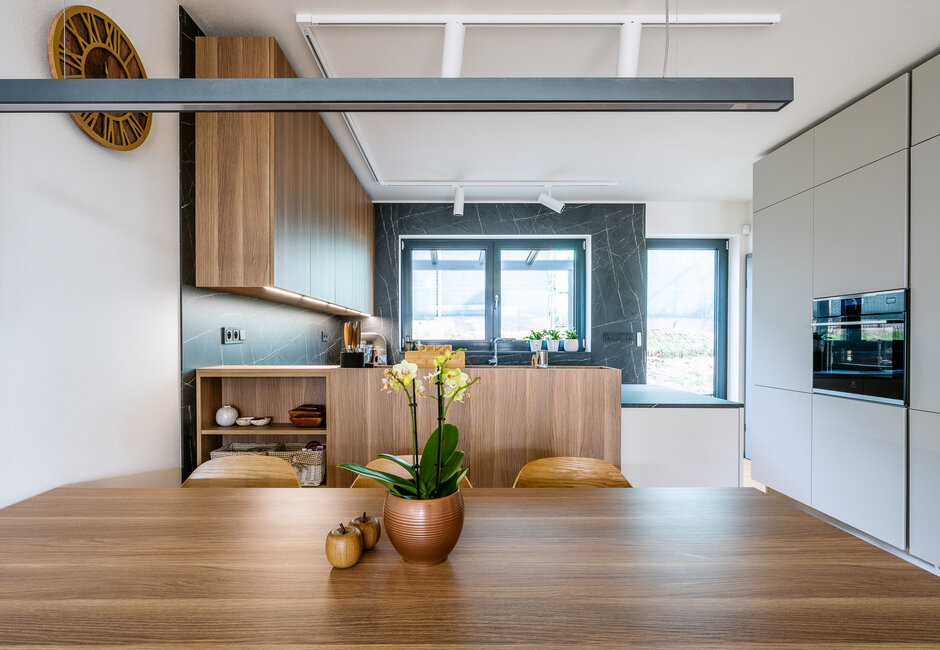
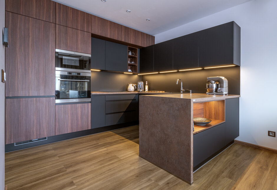
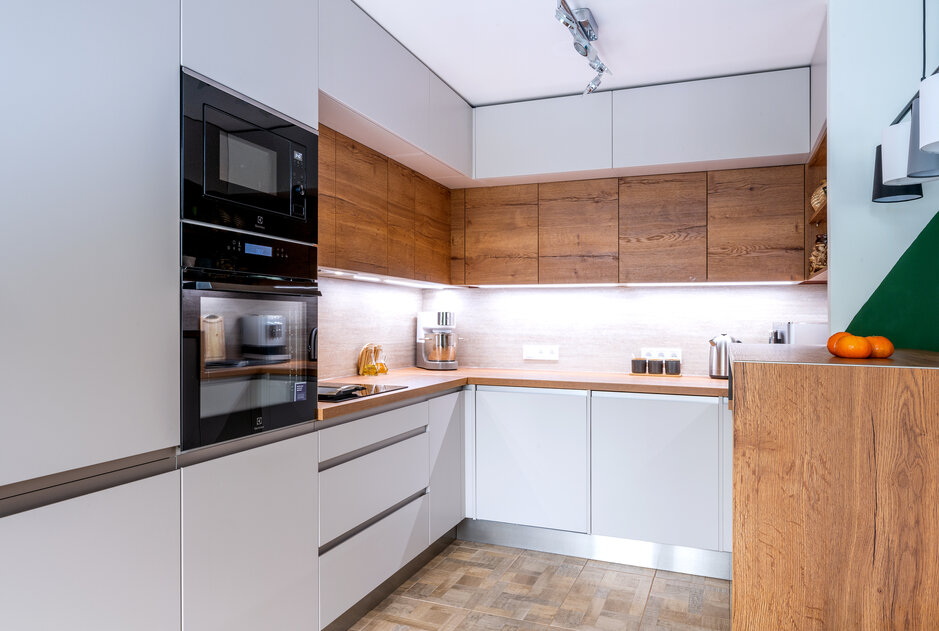
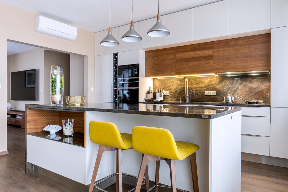
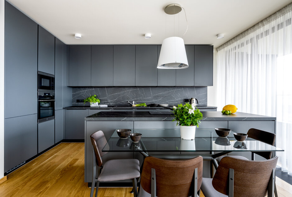
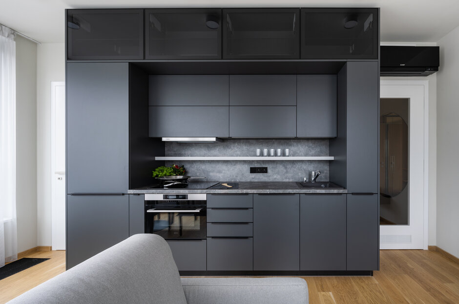
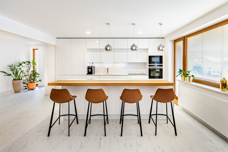
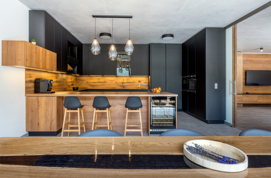
Realize the dreams of others. This one is hers. Imagine that every day, tens of customers are coming to you with their dreams and visions for new kitchens. When the time comes for your own kitchen set, how will it look? You have been through many projects, know all the materials and color variants and are surrounded by limitless inspiration. How difficult will it be to choose one for you? One set. Three walls. Infinite elegance. This time we would like to show you a realization chosen for her apartment by one of our salespersons. She knew from beginning that original ground plan will need to be reworked - previous project assumed only one-wall kitchen. Which would be a pity, not only because of the unexpected generosity of the space but also because of the radiators. If they had remained exposed, it would have felt disruptive to say the least. Therefore, the final choice was a three-wall kitchen set. Washing and cooking zones in the middle are framed by the upper panel of cupboards. The left side continues with worktop equipped with deep bottom drawers that elegantly cover the radiators, while on the right side, a number of tall cabinets with built-in appliances had arisen.

A design that is working for you.
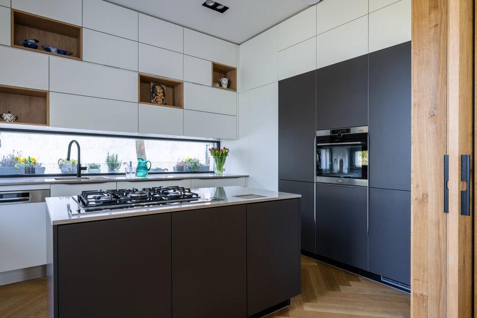
The experience spoke clearly. Great design is one thing, practical use is another, no less important. The kitchen therefore contains a number of clever storage spaces, which are always at hand. In the preparation zone, there is a pull-out unit with integrated plate organizer, among other things. Not far from it, in the corner of the set, we integrated a horizontal seasonings holder. On the contrary, there are drawers under the cooking hob, in which you can reveal cooking utensils, groceries and pots in three levels below each other. Everything in a logical sequence. Everything exactly how the lady of the kitchen had imagined. Because it is useful to get inspired by others, but in the end, it is always best to give priority to your own needs, personal taste and lifestyle. The kitchen is not only a window into the house, but also into the heart of your home.
Tones of concrete
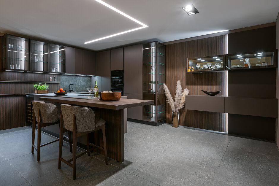
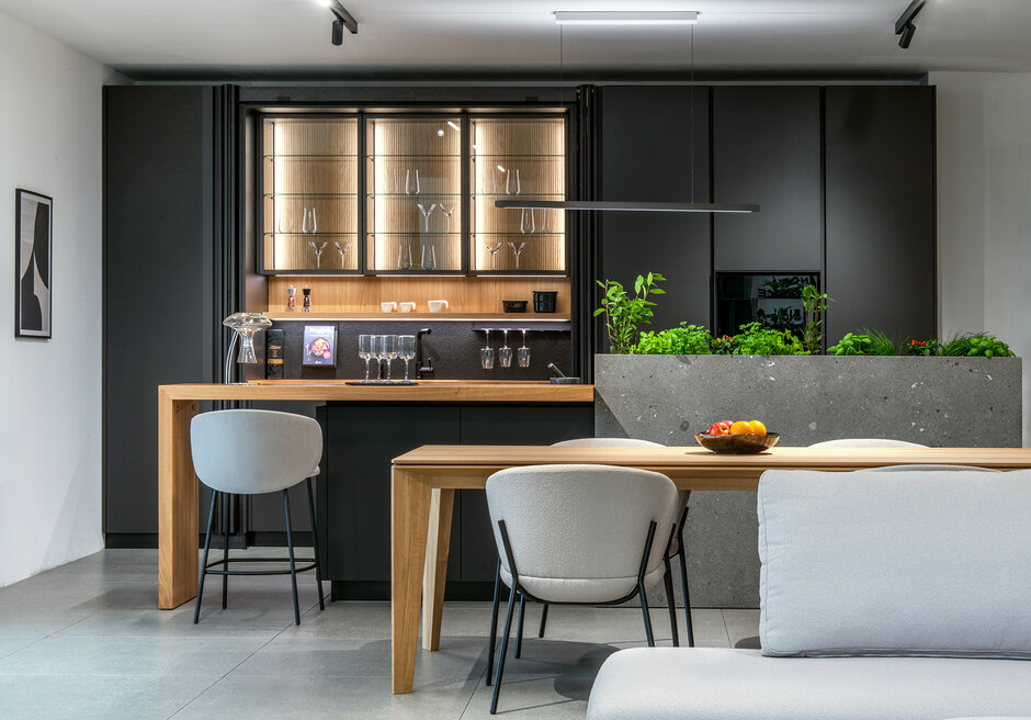
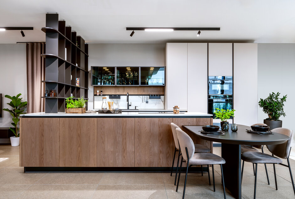
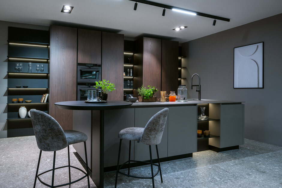
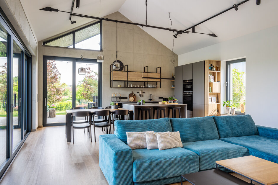
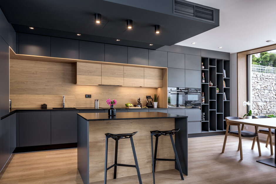
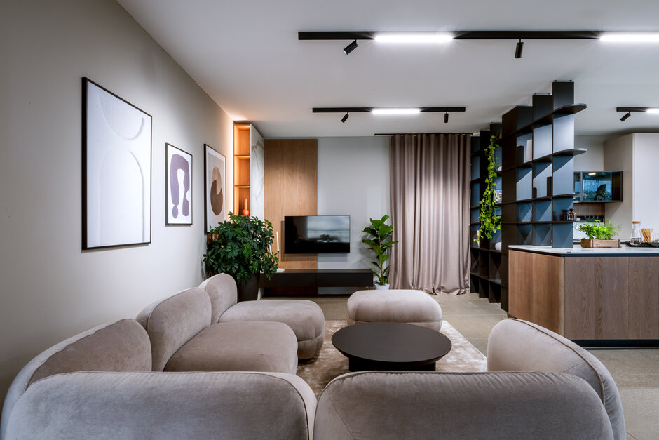
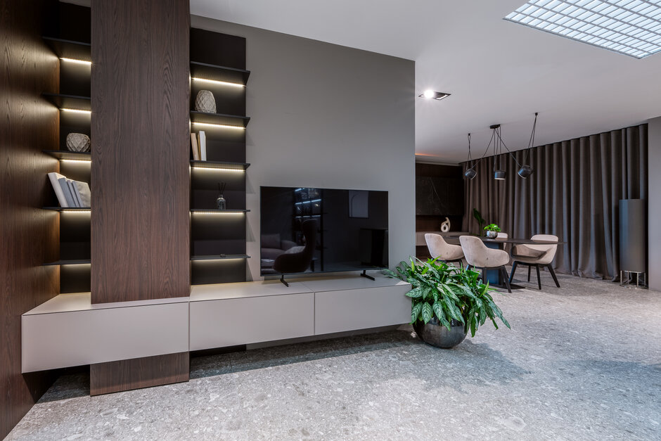
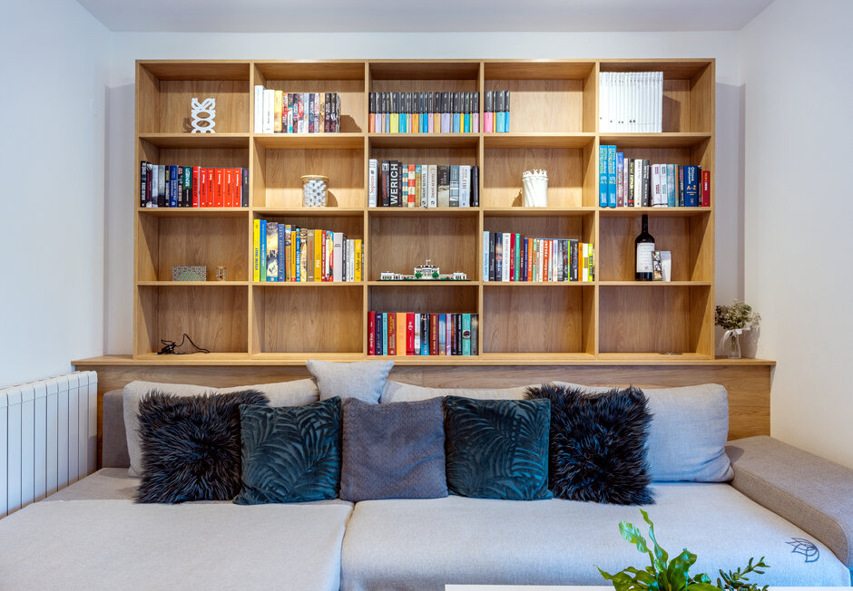
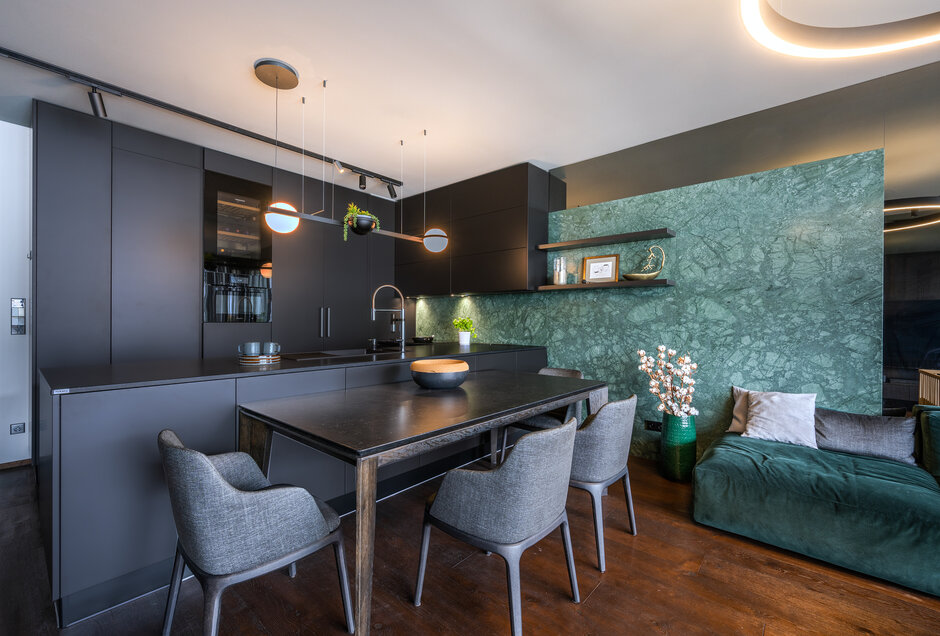
The owner bet on the Technistone Supreme White as a dominant material - it is used on the worktops and the tiling of the upper cupboards. It is creatively complemented by Creative Slate Grey Concrete and Opal Grey shades of concrete, which, apart from the bottom and tall cabinets, occur also on the enclosed boxes around the fireplace. The whole space feels harmonic, unified and interconnected thanks to that. Furthermore, we installed a Creative Cognac Oak element into the interior, to liven up the cold tones. You can notice it especially on the wall-mount cabinets under the television and on the corner bookcases. And finally, the black colored plinths and handles, as well as metal base of the coffee table, amazingly work as a design closure.

